Over the last 90 days, I've systematically rebuilt the marketing websites of luxury apartment buildings across Austin, TX — not theoretical audits, but actual rebuilds from scratch, using each building's real photos, real pricing, and real brand assets. When you do this at volume, patterns emerge fast.
The failures aren't random. The same six problems appear, in roughly the same order of severity, across nearly every property. Property managers don't see them because they're too close to the site and most don't have a baseline for what a converting apartment website actually looks like.
This is the audit. Building names are anonymized throughout. Every number is derived from our actual Austin rebuild sample of seven luxury properties — buildings charging $2,000–$4,500/month, ranging from 100 to 350 units.
Generic hero imagery that isn't the actual building
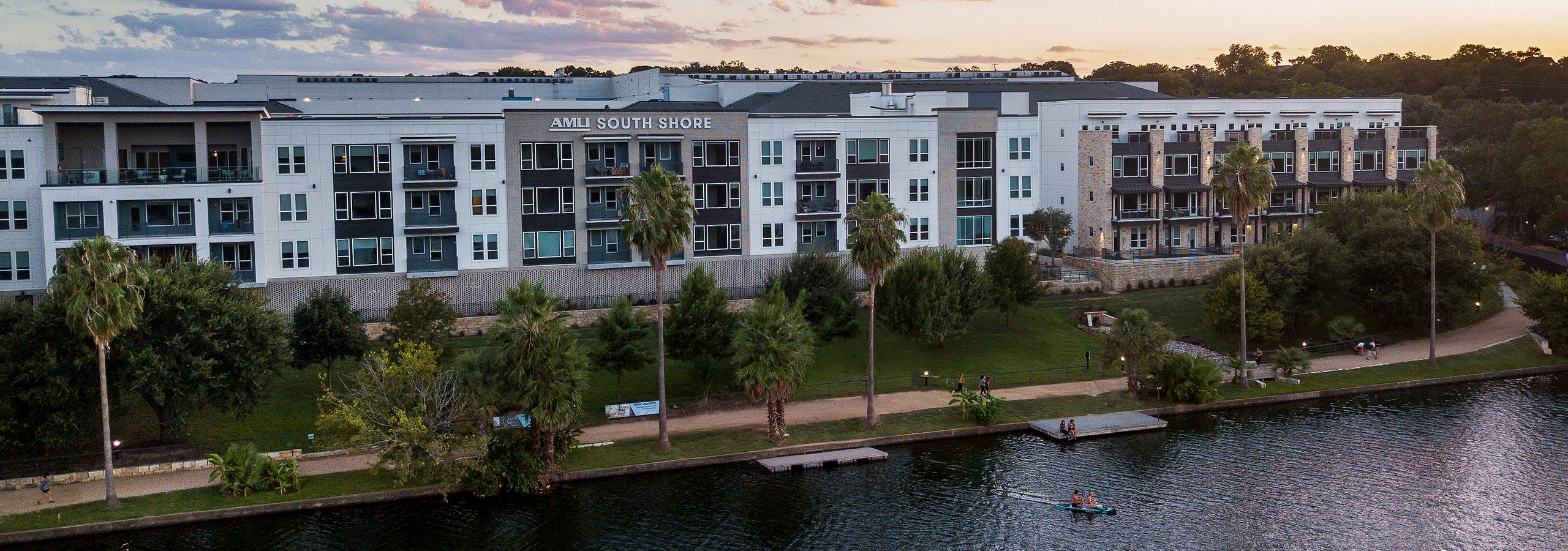
The first thing a prospective renter sees is the hero image. In our sample, most buildings used generic lifestyle photography — staged interior shots that could belong to any mid-tier apartment in any city — rather than photographs of the actual property exterior, signature amenity spaces, or unit views with recognizable Austin context.
Why it costs leases: renters do visual comparison shopping before ever requesting a tour. A hero image of "a nice kitchen" signals nothing about your building. A hero image of your rooftop pool with Austin's Sixth Street skyline in the background, or your building's distinctive glass facade at dusk, is the single most powerful conversion asset on the page — and most properties aren't using it.
The most photo-sparse property in our sample had four accessible images total across its entire site. The richest had 98. The correlation with perceived quality is not subtle.
The fix: The hero slot should show the building's most distinctive physical feature. If you don't have a professional exterior shot or a compelling amenity photo, a half-day of professional photography costs less than one month of vacancy on a single unit. We've seen hero image swaps alone change the visual tone of a site completely — everything after it reads differently.
Floor plan access buried, or PDF-only
Floor plans are the primary decision tool renters use to evaluate a property before requesting a tour. They need to know: bed/bath configuration, square footage, layout, and price. All four need to be one click from the homepage. On most of the sites we audited, floor plans were either buried three levels deep, locked behind a "request info" form, or available only as PDF downloads.
The PDF floor plan failure is particularly costly for luxury-tier properties. PDFs don't render well on mobile (where a significant portion of initial research happens), they require a download interaction that interrupts browsing momentum, and they carry no dynamic information — a PDF can't show current availability or live pricing. The renter who has to download a file to see your 2BR layout has already mentally shortlisted you below the competitor whose floor plan page loaded in under one second.
Three of our seven sites had floor plan sections that showed typology labels ("1 Bedroom", "2 Bedroom") with no accompanying images, no square footage, and no pricing. These weren't even bad floor plan pages — they were effectively empty placeholders dressed as a section.
The fix: Interactive floor plan pages with inline diagrams, live availability indicators, and visible starting prices. No form gates before floor plan access. Our template delivers this with Yardi/RealPage/AppFolio API connections so pricing updates automatically. One click from the homepage.
The tour CTA is invisible until scroll depth three or deeper
The primary conversion action on an apartment website is a scheduled tour. Yet on most of the sites we rebuilt, the "Schedule a Tour" or "Contact Us" CTA was first visible only after three or more full scroll-depths — below the hero, below amenity content, sometimes only reachable by scrolling past a FAQ section. A prospect who arrives with intent rarely scrolls that deep.
This failure mode is invisible to property managers because they're not measuring it. If you don't have scroll depth tracking and conversion event instrumentation on your CTA buttons, you don't know that the majority of your site visitors are leaving before they ever encounter a way to book a tour. You just see the overall conversion rate and assume it's normal.
The fix: Primary CTA — tour booking or contact link — in the navigation bar, in the hero section, and within the first visible scroll on every device. Every BiltOps rebuild ships with GA4 conversion events on every CTA click. Within one month, you have real data on which CTA placement actually drives actions.
Thin photo gallery — fewer than 15 real images, or mostly renders
When we begin rebuilding a property's website, one of the first signals we look at is gallery depth. Our pipeline collects every publicly accessible image from the site. Across our Austin sample, the most photo-sparse property had four accessible images. The richest had 98. Three properties had fewer than 15.
The 3D render problem is related: two of our seven properties used architectural renders as primary gallery content. Renders signal "this is what we hoped it would look like" — and renters evaluating a $3,000+/month unit know the difference intuitively. Real photography of the delivered product, including lived-in unit shots and amenity spaces during actual use, is not optional at the luxury tier.
The fix: 30+ real photographs organized into meaningful categories — exterior, lobby, signature amenities, unit types. A half-day of professional photography for a luxury property costs roughly what one month of vacancy costs on a single unit. It pays back in the first lease it influences.
No trust layer — no reviews, no ratings, no resident social proof
Luxury apartment renters at the $2,500–$4,500/month tier behave more like hotel shoppers than transactional renters. They read reviews. They check Google ratings. They look for evidence that actual residents are happy — not marketing copy written in the property's voice. The majority of sites in our audit had no Google rating, no review embeds, no resident testimonials, and no trust signals beyond generic "why choose us" feature bullets.
The irony: several properties in our sample had excellent Google reviews — 4.2 to 4.5 star averages across 100+ reviews — that were completely invisible on their own website. That social proof exists and is publicly accessible. They just weren't using it. A prospective renter who would have been persuaded by a "4.4 stars · 242 reviews" badge had no way to see it without navigating away from the site.
The fix: Pull the top three Google reviews and the aggregate rating directly into the homepage. Not a testimonials section with unnamed blurbs — actual reviews with author names, star ratings, and timestamps. It's one API integration. We ship it in every build.
The site runs on a CRM template with no real brand differentiation
The most common underlying cause of all the other failures: the property is running a CRM-provided template website — RentCafe, RealPage ILS, or similar — with minimal customization. These platforms are designed for listing-database integration, not conversion-focused design. They constrain what's architecturally possible: you can't implement a real Google reviews integration, you can't restructure the floor plan page layout, you can't control the hero image slot without working around the platform's constraints.
The brand identity failure compounds everything else. A CRM template forces your property's identity into someone else's design system. The fonts, spacing, navigation patterns, and color usage are all constrained by what the template allows — not what your property's positioning warrants. For a luxury building trying to command $3,500/month, a website that looks structurally identical to a $1,400/month complex sharing the same CRM platform is a quiet but real credibility problem.
Renters researching luxury units visit multiple sites in a session. They notice when a site looks like everything else. They don't articulate it — they just move on.
The fix: A custom site your property owns. Not another template, not a page-builder overlay on a CRM frame. Hand-coded around your brand, integrated with your leasing software via API, and built to rank in organic search. The upfront cost is recoverable in a handful of additional leases.
The compound effect
None of these failures are catastrophic in isolation. The problem is that they stack. A property running a CRM template with a generic hero, inaccessible floor plans, a buried CTA, a thin photo gallery, and zero review content isn't competing poorly on one dimension — they're losing on six simultaneously. And the prospect who visits and bounces doesn't leave feedback. They just don't book a tour.
If your building's site has any of these patterns — we'll show you the fix. We'll rebuild a demo version using your actual photos and brand in under 10 minutes, free. No pitch deck, no three-week discovery process. You'll see what your property looks like with all six of these corrected, before you make any commitment.